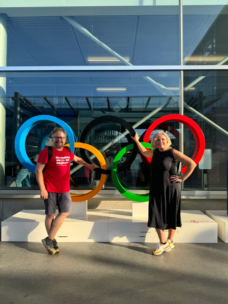
Paris 2024 was destined to be a pilgrimage point for DeMomentSomTres. We couldn’t miss an event of such magnitude by any means. Moreover, we had to voice our opinions on brand usage, visual identity, and especially the user experience.
This post is the result of a fleeting trip to the French capital to closely experience the 21st-century European event that reaffirms the minimal, perhaps non-existent, distance between digital and analogue experiences.
UX in the City of Light during the Olympics
User experience is what truly matters; we can’t stress this enough.
User experience is what truly matters; we can’t stress this enough. It’s what leaves a good taste in your mouth, makes it memorable, and turns the user into a fan. In the case of Paris, everything during these 15 days is perfect or nearly so:
The Paris 2024 Public Transport App Works
Getting from any of the metropolitan airports to the city centre is effortless. The app manages integrated ticket purchases and provides real-time information. It contains basic interactive maps and thematic ones. The logic of the digital environment is extremely intuitive.
The integration of the ticket with mobile phones, whether Android or Apple, is flawless. Once installed, the mobile phone functions as the public transport card without any additional action required, as it can be presented at the designated entry barriers. No need to unlock it or press a button. Abracadabra.
We had had previously downloaded the app at home and purchased an integrated ticket for the day while heading to the metro. In 25 minutes, we were in the centre of Paris. No entry barriers, no friction points. And public transport is punctual, fast, and with an enviable frequency, especially for those who suffer from the disaster of Barcelona’s suburban trains.
Parisians Are Friendly and Proactive
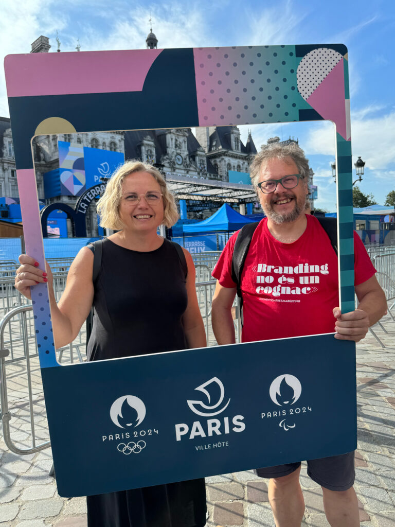
Yes, you read that right. The French are not obnoxious. At the very least, they have refined the friction point that previously obscured the user experience of every Paris visitor. Now the city is full of friendly Parisians who guide you out of the metro, who offer to take your photo with Instagram frames without having to worry about your phone being stolen.
They make themselves understood in any necessary language. The code they use is universal. They avoid queues, advise you, and in case of unforeseen events, propose a valid alternative to fleeing the city.
Even in a moment of chaos, such as having to leave the metro station due to a potential danger situation, which, yes, we also experienced, there is no panic, and everything happens in an orderly manner.

The Olympics’ App Provides Relevant Information Based on Who You Are
Segmentation by buyer persona is the basis of any marketing strategy, and they are gold medallists in this too. Tell me which user you are, and I will suggest what suits you best.
If you want to know the ranking of countries with the most medals, you’ll find it. If you wish to attend an Olympic event as an audience member, you can get there without problems. Even if you wish to know what event is happening at any given moment from home and watch it on screen, the details are there.
Even if you are also a rare user who likes to attend cultural events that you think have little to do with sports (if you still think the Olympics is a major sporting event, you will also find information to book or buy tickets, or even buy souvenirs.
Is the Visual Identity of the Paris Olympics Memorable?
The visual identity of Paris is Paris. It requires nothing else. Everyone has a Paris in their mind. However, is the graphic image of the 2024 Olympics strangely simple? Is it naïve? What does this logo mean? Why have they chosen these complementary pink and bluish colours?
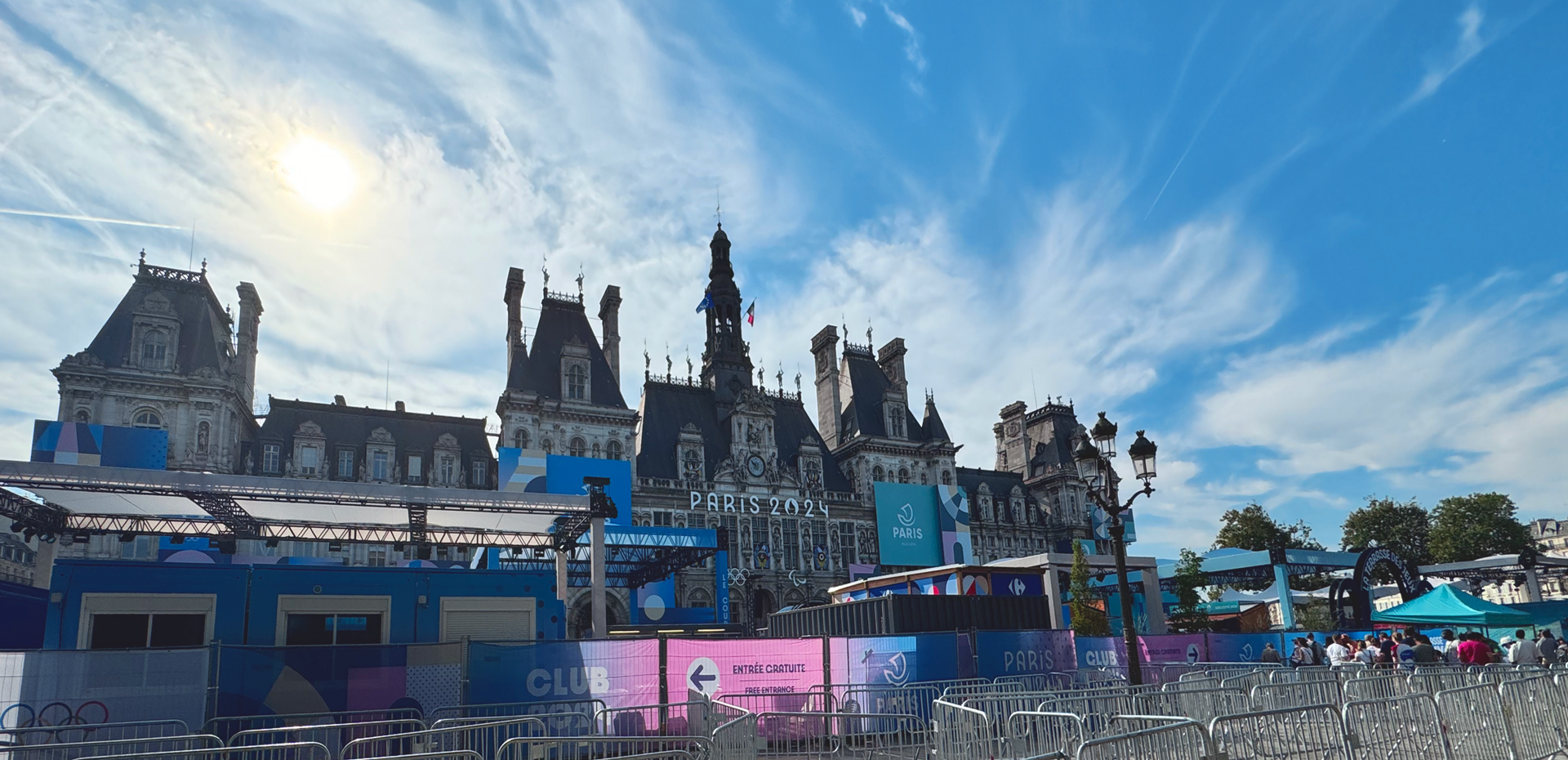
Like many of the event venues in the city, the brand will also be ephemeral. What matters is that it works here and now. It is identifiable and has a graphic narrative and a subtext that depends on what each person wants to see. But what is undeniable is that these two weeks are a container of memorable experiences, Instagram Reels owned by the users and not the brand itself.
This is much more powerful than a brand that devours its purpose. The applications of Paris 2024 will blend into something much larger, which is the experience that each person has had, where for the first time in history, there is no border between digital and physical. They will disappear from the city like the stands at Trocadéro or the theatres at Concorde.
What endures is the emotional impact left on each user who has somehow consumed snippets of these games. Paris has once again won for eternity as the most desired city.
The Paris Brand Stirs to Reclaim the Podium

These Olympic Games have served to sell us a brand we had already bought. The fervent dream of anyone dedicated to marketing and business.
That’s the essence of grandeur, or always thinking big. The awareness that what endures is reaffirmed periodically. That avant-garde and innovation are not assumed, they are worked on and risked.
It has left us with great contradictory images, but they are a metaphor in themselves. The filth that the Seine River takes away downstream, along with the health of some triathletes, the mayor of Paris who had to take a dip…
France, with the Games in Paris, has reaffirmed its status as the world’s top tourist destination for a reason. It has understood the context of extreme digital interconnection and played it in its favour, maintaining the immovable elements of centuries ago: the deeply human desire for the extraordinary, the epic of making history even if it’s just on Instagram.
